For the last 2 months I’ve working on one of the @improving macs almost exclusively. While that’s definitely had it’s annoyances, it’s also been very eye opening in a couple of areas.
Last month Microsoft released the Release Canidate1 of Windows 7. For what it’s worth I will say that I like it, more importantly, my wife likes it too. Just like Vista has nicer features than XP (no seriously, I actually like Vista!), there are features in Win7 that I really like over Vista. That being said, after spending two months on a Mac, here are the things that I wish Microsoft would “barrow” from Apple before Windows 7 RTMs.
Apple’s “Show Desktop” Implementation
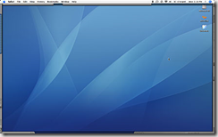
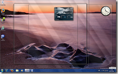
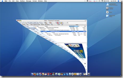
I like Win7’s Desktop Peak. But let’s be real. When I want to look at my desktop, it’s probably because I want to do something on my desktop. If I click on the “Show Desktop” button, then everything get minimized and I loose my place when I’m done with the desktop (I have to go restore all of my Windows manually). Macs have this great feature that let’s me, in a single motion, push everything to the side, lets me see and work with my desktop, then with a single click anywhere on the edge of the screen and I’m back to where I was before. Awesome. Dear Microsoft, I know what they’ll say, you stole it. Mac had it first. it doesn’t matter. Go ahead, take it. It’s a better implementation. thx.
Apples “Widget” View
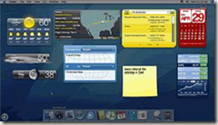
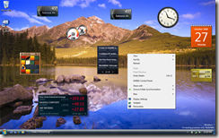
I like Widgets, I like Gadgets. I’m not talking about Apple’s widget “zoom in” and “zoom out” views (although those are nice!), nor am I talking about how Windows 7’s Gadgets can go anywhere on the desktop and are always on your desktop (although I like that too!) I am specifically talking about the scenarios when you have a bunch of windows open and your in the middle of working and you need to take a quick look at your widgets/gadgets. On a mac you set your Expose’s hot spots to bring up your “dashboard”, in Windows 7 you either “peak” at your desktop, or you press the Win+G keys.Here’s the thing, on a mac when you do that, they do a dark overlay on the rest of your desktop. It makes it really easy to to focus in on your widgets and see them quickly. it sounds like a small thing, but you already know how busy your screen can get when you’re working on various projects and then you try to see your gadgets and they just don’t stand out very well.Dear Microsoft, please fade out the background when I push Win+G. kthx.
Apple’s Colors.
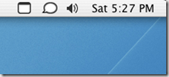
Not all of their colors. I like some of the rich look of Vista and Windows 7, but here’s something that I noticed while working on the mac. The “system tray” (or whatever you call it) is boring. Everything is the same color. Compare that to the spectrum of color that the average Windows user is used to. It’s not that color is bad… but I’m starting to think that business is. Business and clutter compete for your attention, and let’s face it… the reason that it’s in the system tray is because it’s important.. it’s just not that important. I know that I’m focusing on the system tray, but really I’m talking an over all effort to make the things that I want to focus on, visually focusable (is that a word?). Reduce noise, increase signal.
So what does Windows 7 have going for it?
A lot. But here’s the thing that it soooo much better on Win7. The Taskbar – so much better than the dock or expose for moving between applications – especially tabbed windows. On one hand, I really like the pop and slide of exposes, and I really like the fish eye affect in the mac dock… but here’s the deal, the dock is great for launching applications, but it’s lousy for moving between open applications. The new Win 7 dock does an amazing job of organizing all of your open tabs regardless of which window their in. It really creates a nice, unified way to move between the things that you are working on and to close the things that you don’t care about. I know that it sounds trivial, but think about where you spend your time – it makes a difference.
What about you? What are you love / hates with Windows 7 or teh mac?
BTW – Travis promised to teach me some mac foo… I’ll have to post again after that!

