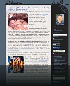
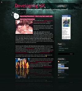
I’m not done yet… but I do like the changes so far.
If you are watching my RSS feed then you might not have noticed the change. Ultimately I’m planning on merging my Health Blog and Developing UX into a single space. I’m still trying to figure out the best way to organize my content by categories. Development, Health, Family, Religion, Politics, Entrepreneurism are the categories that I’m thinking about, of course I’d still like UX, Silverlight, Speaking, CommunityCast, SixFlags, Microsoft in there… so I’ve still got some thinking to think about.
Of course, not everyone likes the change…
![]() randypeterman @CalebJenkins if UX is your priority DO NOT do white/grey text on dark colors. 'cept when showing people what not to do.
randypeterman @CalebJenkins if UX is your priority DO NOT do white/grey text on dark colors. 'cept when showing people what not to do.
Well… I didn’t say that I was done yet. What are your suggestions?


I'd take the lightest green from the banner/splash/radial gradient bit and lighten that up even further so that the background can be light with dark text on it. That may look like crap, but when I see the brightness of this comment box, I know that you can pull off something bright around it to help it fit in a bit more smoothly. The transparency of the png background makes it easier to adjust the intensity of the 'darkness'. <– not hairband reference.
Looks great in Safari 4.0.3, great job!
I dig it.
I dig it.
Welcome to buy mbt shoes, mbt tataga and mbt discontinued all enjoy top quality and free shipping.
MBT Huge Selection. Shop Visually. MBT Shoes no tax. Low price guarantee,MBT Habari Easily achieve your fitness goals.
Buy MS office 2010 Today with our 30-day refund promise!Microsoft Office 2010
Office 2010,Office 2007,Microsoft Office 2007,Microsoft Office
Windows 7,Microsoft outlook,Outlook 2010,Microsoft outlook 2010
We are the best software supplier.Microsoft Office 2010,Office 2010,Office 2007,Microsoft Office,Microsoft Office 2007
Office 2007 key,Office 2007 download,Office 2007 Professional,Windows 7,Microsoft outlook 2010
We are authorized reseller for the software vendors mentioned by Microsoft.Microsoft Office 2010,Office 2010,Microsoft Office 2007
Office 2007,Microsoft Office,Office 2007 key,Office 2007 download,Office 2007 Professional,Microsoft outlook
Microsoft outlook 2010