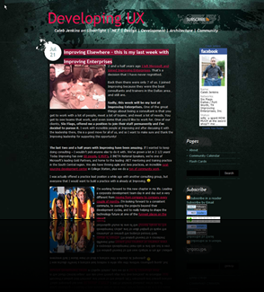
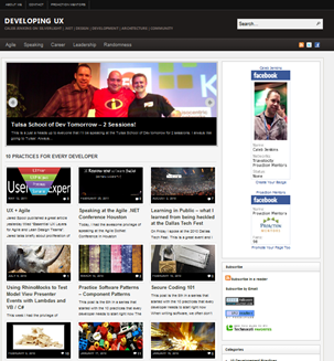
About a year and a half ago I refreshed the look of my blog, one of the things that always bothered me was that it pretty much maintained a chronological listing of post with no easy way to surface topics and concepts once their time span had passed. I discovered this new WordPress theme this week and really liked how it brought so many categories and articles to the surface in a presentable and consumable way.
What do you think? Do you like the new look?


It seems a little too vanilla. For someone with your personality, or for a UX person in general, the theme should really say, “This is Caleb Jenkins site.” The design isn’t evocative. It isn’t playful. It doesn’t make me think, “Hey Caleb, good to see you again.” You aren’t wearing your site.
There is also a lot of clutter down the right. Are all the badges really necessary? Could those just go hide on your “About” page? Personally, I don’t care that you’re a MVP (that moniker doesn’t carry a lot of weight with me, but that’s another conversation). Your writing speaks for itself. Anyone can read your blog and say, “That Caleb Jenkins, he knows his stuff.” I would also put the SlideShare thing-a-ma-jig at the top rather than at the bottom.The main page looks more like a commercial website than a blog, but that may be what you are going for. Maybe a “Top Five” box with a tab for each of the five would be better? I had to scroll 3/4 down the page to find this post once on the main page, and it is your 3rd most recent.
The readability might be improved, but I don’t recall readability being a problem with the old theme.What is your goal in a redesign? To aid in navigation? You may be helping your reader find your most visited content, but you are hiding your new stuff under a basket. Maybe this is applicable here: http://www.alistapart.com/articles/redesignrealignI don’t mean to sound harsh, but I think you can do better.Kudos on trying out a new theme. I’ve been rather lax in that department.